
Game analytics · Part 01 of 8 · August 24, 2026
The Price of a Player: Forecasting CPI
Written to a disclosure policy: errors, rankings, biases and coverage are reported as measured; totals, prices and dates finer than a year are withheld, and the two titles are pseudonyms. Every figure traces to a named table, listed at the end.
The question
Every revenue forecast for a free-to-play game begins with a number nobody controls directly: how much it will cost to acquire the next player. A studio sets a budget. The market sets the price. Divide one by the other and you have installs; installs become cohorts; cohorts become revenue. If the first link is wrong, everything downstream inherits the error, multiplied.
So before I could say anything credible about cohort lifetime value, I needed to know how well cost-per-install (CPI) could be forecast at all — and, more specifically, whether the way I had forecast it in the past was any good. The method I had carried around for years was a log-linear trend with a seasonal term, fitted to blended monthly CPI. It is the textbook answer. It is also, as it turned out, one of the worst of the fifteen models I tested.
The decision this feeds is concrete. A UA team asks for a quarter’s budget and promises a number of installs. The forecast either supports that promise or it does not. What I cared about was not whether a model ran, but whether I would sign my name under the install count it produced.
Why acquisition cost is harder to observe than it looks
Blended CPI looks like one time series. It is not. It is a weighted average over every country, ad network and platform the studio bought on that month, and it moves for two entirely different reasons.
The first is that prices change. An auction gets more competitive; a network raises its floor; a market heats up before a holiday. That is a forecasting problem, and a hard one.
The second is that the mix changes. The team shifts budget from an expensive tier-one market to a cheaper one, or from one platform to another, and blended CPI falls — not because anything got cheaper, but because the average is now taken over cheaper things. This is not a forecasting problem at all. It is a decision the UA team makes, and therefore something they already know.
A single-series model cannot tell these apart. It sees the blended line wobble and tries to extrapolate the wobble. My initial instinct, years ago, had been to add a seasonal term to absorb the periodic part of that wobble. The trouble is that most of it is not periodic. On the account I studied, CPI moves in regimes: a slide to a quarter of its long-run mean over a few months, then a climb to more than double it. A trend fitted anywhere in that sequence reads the regime as a slope and projects it forward forever.
There is a further wrinkle that only became clear once I looked at where the data stopped. Both titles I worked with wound down their paid acquisition, the first during 2021. Monthly spend falls by roughly two orders of magnitude across that year and then stops; the final months are a residual trickle against no attributed installs. Every result below was therefore measured on a UA programme that was actively buying users, and none of it says anything about the period after.
My approach
I ran a rolling-origin backtest of fifteen aggregate CPI models plus a family of
structural models against a real account, stepping the forecast origin forward
month by month and scoring each model on what actually happened. Seventeen
origins in total (postgres__cpi_model_selection_rolling).
The fifteen aggregate models are what you would expect: carry the last value forward, means and medians over several windows, spend-weighted means (a low-spend month is a weak price observation, so it should count for less), a seasonal naive, log-linear trends with and without seasonality, a damped trend, an ARIMA, an ARIMAX with spend as a regressor, and a spend-elasticity model in which buying more installs costs more per install.
The structural family is different in kind. Instead of forecasting one blended
line, it forecasts CPI for each country tier × network × platform cell and
then recombines those cell forecasts using the spend mix the team plans to
buy:
blended CPI = Σ over cells of planned_share(cell) × forecast_CPI(cell)The equation is trivial. The point is what goes into the second factor. If the team’s allocation is known — and it is; they wrote it — then only the first factor needs forecasting, and the first factor is far better behaved than the blend.
Two engineering choices made this workable. Countries are clustered into tiers by CPI using a one-dimensional k-means weighted by spend, so a large market is not outvoted by a long tail of tiny ones. And each cell’s CPI estimate is shrunk toward the blended rate with a strength expressed in installs: a cell where the studio bought a handful of users is pulled hard toward the average, and a cell where it bought a lot barely moves.
Then the rest of the chain: paid installs are spend divided by forecast CPI; organic installs are forecast separately; effective CPI (spend over all installs, including organics) is derived at the end rather than modelled.
The assumptions doing the heavy lifting
Spend is known. The whole study takes the budget as an input rather than a forecast target. A studio controls its spend; the forecast’s job is to say what that spend buys.
The plan is known. This is the assumption the champion model rests on, and I tested what happens when it fails. Strip the plan out — keep the total budget but freeze the recent mix instead of using the intended one — and the structural model degrades to worse than a trailing spend-weighted average. The edge comes from the plan, not from the granularity. That is the single most actionable thing on this stage, because it says what to ask a studio for.
Prices within a cell are more stable than the blend. Not guaranteed. It held here, and the shrinkage is the hedge against a thin cell where it does not.
The regime that produced the evidence is the regime the forecast will operate in. This one I can only flag, not defend. The evidence stops when the spending did.
Where reality became inconvenient
The panel ended, and the flattering explanation did not hold up. The wind-down coincides with the industry-wide privacy change of the same year, and there was an obvious story available: attribution broke, so the data ended. I found I could not support it. The decline in spend was already well under way before the privacy change landed, and blended cost had roughly doubled in the months before it. What the evidence points at is a business decision to stop buying. I record this because I initially wrote the other version.
A consequence worth naming: the organic share of installs rises to essentially 100% by the end of the panel on both titles. That is arithmetic — paid spend went to zero, so every remaining install is organic by definition. It is not players arriving differently and it is not attribution failing. A “the privacy change drove organic to 100%” claim built on this data would be reporting one studio’s budget decision as a market shift.
The wind-down months would have poisoned the panel. A residual trickle of spend against no attributed installs produces absurd price points. Guards on minimum spend and minimum paid installs exclude UA pauses from the price series; without them those months dominate any average.
The synthetic benchmark ranked the wrong model first. I had a seeded
synthetic CPI series and ran the same fifteen aggregate models under the same
protocol on it (generated__cpi_model_bakeoff_synthetic). On synthetic data
all fifteen land in a narrow band, between 0.085 and 0.225 mean error, and the
one that ranks first is seasonal_naive. On the real account the same fifteen
spread from 0.503 to 2.638, seasonal_naive scores 0.661, and the winner among
aggregate models is spend_elasticity. Had I selected a model on synthetic
data, I would have shipped the wrong one.
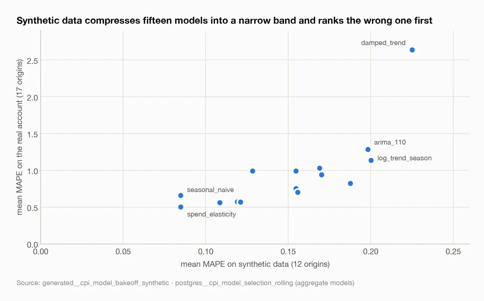
Each dot is one aggregate model scored on both worlds. The horizontal spread is a fifth of the vertical: synthetic data cannot tell the models apart, and the two it likes best are not the two that survive contact with a real account.
What the estimates actually say
The structural model wins, and every trend model finishes at the bottom. The
champion configuration — country tiers by network by platform, a year of cell
history, heavy shrinkage, plan-weighted mix — scores a mean MAPE of 0.347 across
seventeen origins, with a median of 0.323 and a worst origin of 0.597. The eight
best models in the ranking are all structural variants. At the other end,
log_trend_season — the model I used to use — scores 1.136, arima_110 1.285,
and damped_trend 2.638. Trend extrapolation on a series that reverses is not
a forecast; it is a bet that the reversal will not happen.
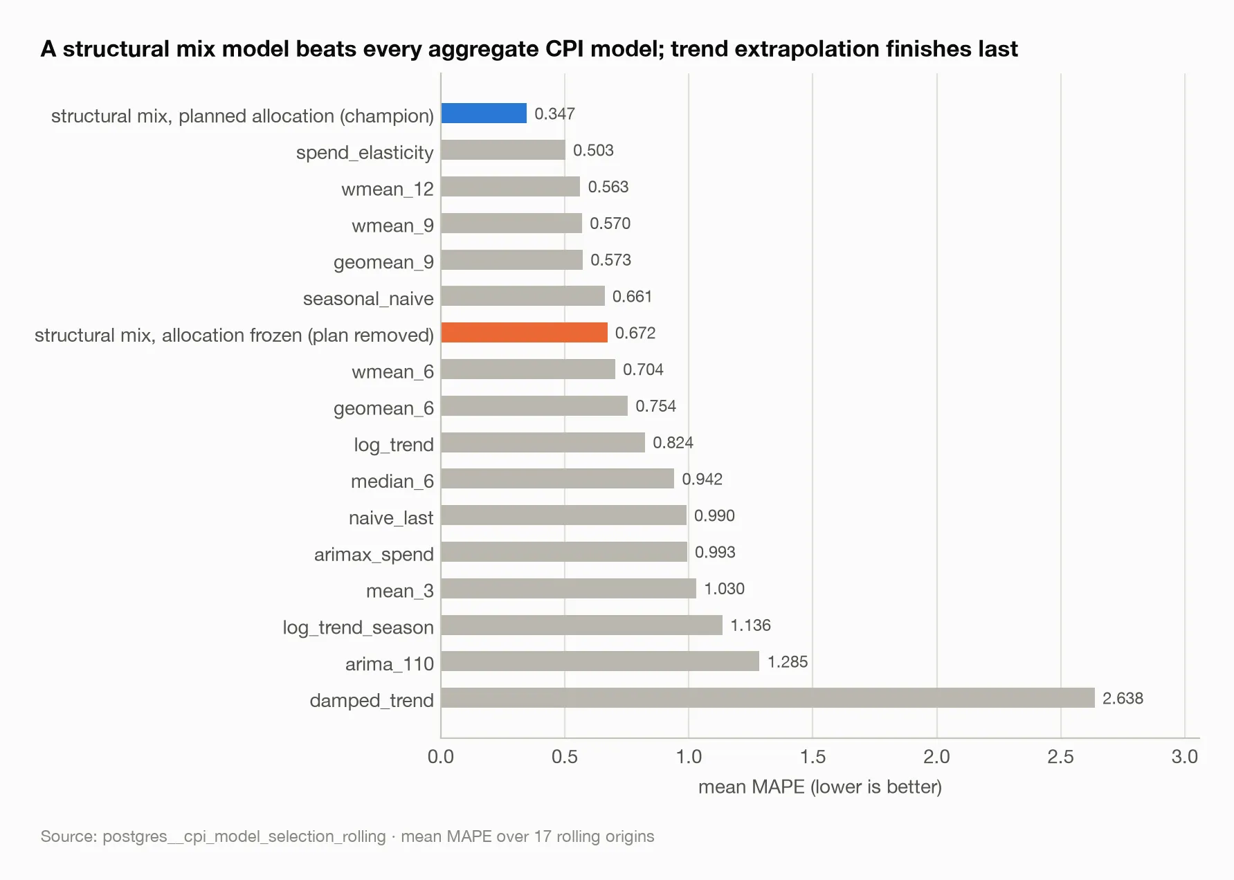
The orange bar is the ablation that matters: the same structural model with the plan removed drops to the middle of the pack. The edge is the plan, not the granularity.
The observed path shows why. Publishing CPI as an index (each value divided
by the mean of the observed series, so the base is 1.0 by construction) keeps
the shape while hiding the price. In the first out-of-time window, cost starts
at 0.917, jumps to 1.711 the next month, and then falls to 0.465 over the
following four. In the second window it slides to 0.232 and, three months later,
sits at 2.067 (postgres__chain_validation_detail). The champion does not
predict these turns. It declines to chase them: the observed series spans
roughly an order of magnitude and the forecast moves within a threefold range.
Against a series that reverses, that restraint is most of the available edge.
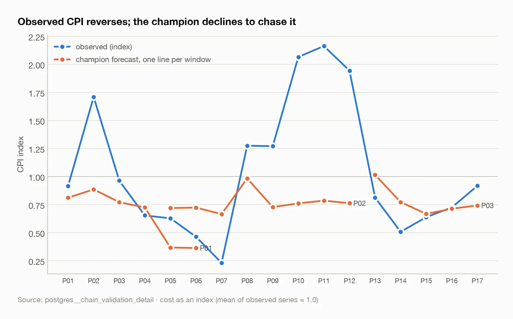
The observed index spans roughly an order of magnitude across the panel; each window’s forecast moves within a threefold range. The gap between them in the second window is the honest measure of how much movement no CPI model here explained.
Down the chain, counts of people forecast better than money per person.
Across three out-of-time windows covering a demand shock and running up to the
wind-down, mean CPI error is 0.366, paid installs 0.488, organic installs 0.198
and total installs 0.231 (postgres__chain_validation_accuracy). The
composition partly cancels — total installs are better than either component —
because the organic model’s floor absorbs some of the paid error.
Effective CPI should be derived, never forecast. Modelling eCPI directly
loses to deriving it from forecast paid and organic installs in every window:
0.164 derived against 0.551–0.715 for the direct models in the first window,
0.094 against 0.211–0.663 in the third (postgres__ecpi_vs_cpi_routes). The
reason is structural. Organic installs carry no spend, so eCPI is a ratio whose
denominator has a component with no price signal in it. There is nothing to
model.
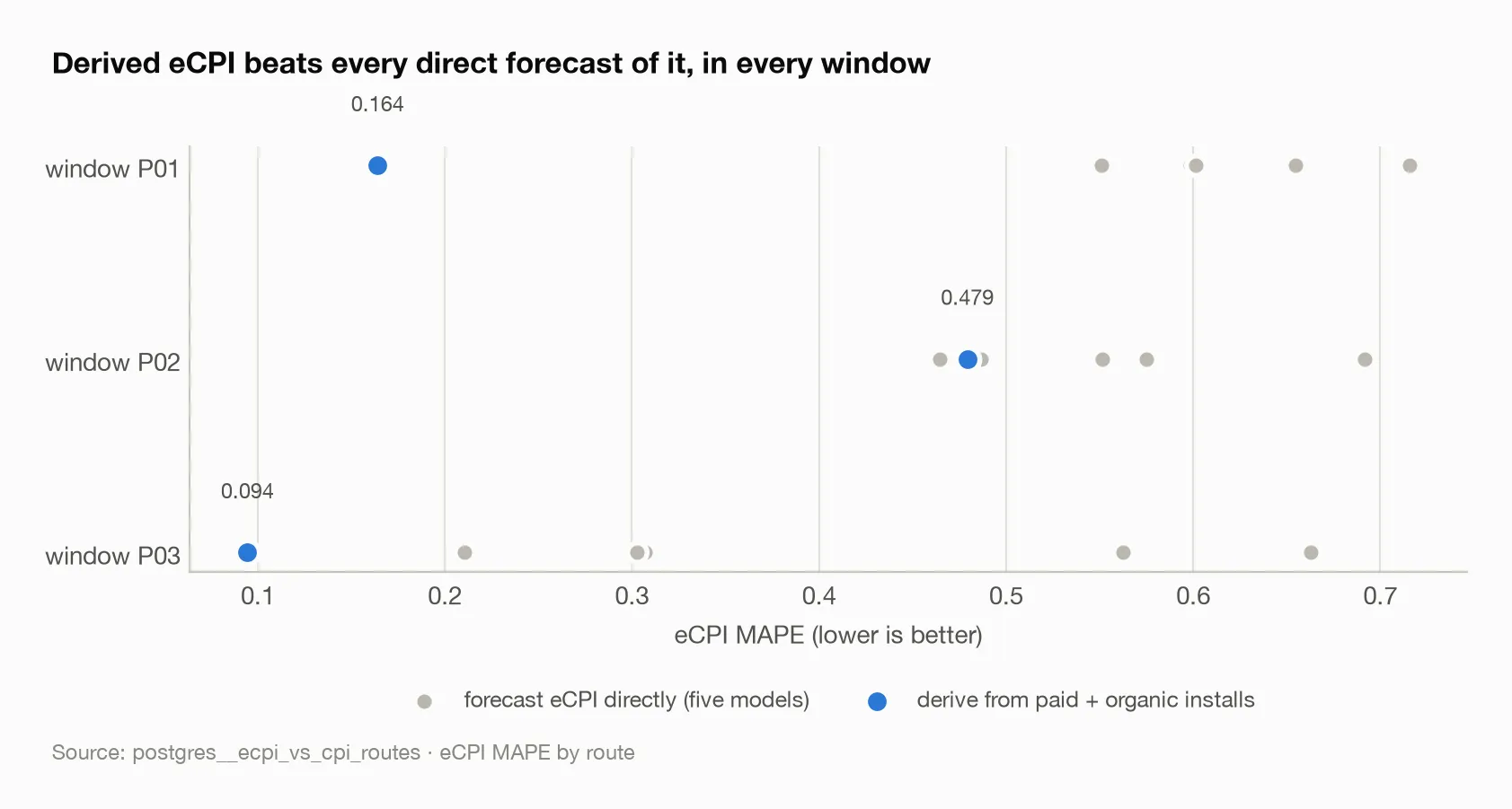
In the second window the derived route is only narrowly ahead, but it is ahead in all three, and it is the only route that is never the worst.
Estimation practice does not transfer between stages. Country-tier pooling
is what makes the CPI model work. On organic installs it loses to a two-parameter
model, organic = base_rate + K × paid_installs, which scores 0.194 in the
window where carrying the last value forward scores 1.587
(postgres__organic_model_bakeoff). Each stage earns its method with its own
backtest.
The uncertainty is honest about being thin. The forecast ships with an
empirical band calibrated on prior origins. In the earliest window there were
three prior origins — too few to calibrate anything — and the report says so
rather than quietly widening the band. In the later windows coverage is 0.5 on
eight periods and 1.0 on five (postgres__cpi_interval_coverage). Those are
small numbers and I would not build much on them.
What I would change next time
Extend the structural comparison to synthetic data. The synthetic bake-off runs only aggregate models, because the generator has no network-by-country panel. Building one would let the champion be tested on both sides and would sharpen the synthetic-versus-real claim, which currently rests on the aggregate family alone.
Test the plan assumption as a spectrum, not a switch. I measured “plan known” against “mix frozen”. Real plans are partially known — the team commits to a budget split at tier level but not at network level, say. Where on that spectrum the edge disappears is the practical question a UA lead would ask.
Find an account where the programme did not end. Everything here is pre-wind-down and, coincidentally, pre-privacy-change. The method may or may not survive in a world where attribution is coarser. I do not have the data to say, and I would rather say that than guess.
The broader lesson
The model that won is not clever. It is a weighted average of cell-level estimates. What made it win was refusing to forecast something the studio already knew — the mix — and refusing to extrapolate something the data said would reverse — the trend.
The model that lost was the one I had trusted. It lost because it treated a managed quantity as a natural one. Blended CPI is not a market price. It is a market price filtered through a sequence of decisions, and the decisions are the easy part to know. My instinct had been to model the outcome; the better answer was to model the parts and let the decisions in as inputs.
And the panel taught me something about scope that I nearly got wrong in print. When a series stops, the first question is whether the data ended or the behaviour did. Here it was the behaviour. The difference between those two readings is the difference between an evidence boundary and a false claim about an industry.
Sources
Every figure above traces to one of these tables:
postgres__cpi_model_selection_rolling— the fifteen-plus-structural rankingpostgres__chain_validation_detail— observed and forecast CPI as an indexpostgres__chain_validation_accuracy— stage errors by out-of-time windowpostgres__ecpi_vs_cpi_routes— derived versus direct eCPIpostgres__organic_model_bakeoff— organic install modelspostgres__cpi_interval_coverage— empirical band coveragegenerated__cpi_model_bakeoff_synthetic— the same bake-off on seeded data