
Game analytics · Part 04 of 8 · August 24, 2026
Each Cohort a Little Worse Than the Last
Written to a disclosure policy: errors, rankings, biases and coverage are reported as measured; totals, prices and dates finer than a year are withheld, and the two titles are pseudonyms. Every figure traces to a named table, listed at the end.
The question
A composed cohort forecast over-projects at long horizons. The mechanism is easy to state: per-age rates are learned from older cohorts, and each new cohort is slightly worse than its predecessor, so the rates are always a little too optimistic for the cohorts they are applied to. Successive acquisition cohorts decline in quality for reasons every studio knows — the cheap, high-intent audience gets bought first; the media mix drifts toward cheaper and worse; the game ages.
The question was whether I could measure that decline and correct for it. The answer, over five investigations and two titles, was: yes, but not the way I first built it, not for the cohorts I first applied it to, and not on the evidence of one game. This essay is about how most of what I concluded from the first account turned out to be wrong on the second, and what survived.
I report both halves because a case study that only publishes its successes is not evidence of method, and one that only publishes its failures has not finished the work.
Why cohort quality is harder to observe than it looks
Cohort quality is not a column in the data. It is a residual — the part of a cohort’s behaviour that its age does not explain. To see it you have to fit the age profile first and look at what is left, and what is left is small, noisy, and confounded with everything else that changed over the same months.
Two things make it especially slippery. First, a decline in quality can show up in the shape of a cohort’s curve (it decays faster) or in its level (it starts lower and decays the same), and a measurement designed to catch one is blind to the other. Second, quality drifts over the same axis as everything else — time — so any feature that also trends over time will look like it explains quality whether or not it does. Both of these bit me.
My approach
Five steps, in the order I actually took them.
Measure the drift. On the first title, survival at a fixed age — a cohort’s value at age n divided by its value at age zero — falls steadily from one install cohort to the next. I fitted a slope per age and found the slopes clustered tightly, which said the drift was a global property of the game rather than many separate per-age facts. So I pooled them into one drift parameter, shrunk toward zero and damped as it projects forward.
Locate the error. The composed forecast splits exactly into three groups of
cohorts — young (installed before the origin, early in life), deep (installed
before the origin, past the core age) and new (acquired after the origin, no
history at all). The groups sum to the total, so attributing the bias to them is
arithmetic, not inference (bias_decomposition__bias_contribution). I
corroborated it by substituting actual values for one component at a time and
re-scoring (bias_decomposition__oracle_bias_by_horizon).
Replicate on the second title. The same drift measurement and the same
out-of-time test on the other game (drift_validation__*).
Try the attractive alternative. Cohort quality correlates with acquisition
mix, and mix is something a UA team chooses — so quality might be forecastable
from the media plan rather than from a blind time trend
(mix_quality__*).
Build the version the evidence pointed at, and replicate that too. A drift
measured on the level of revenue per install, applied to the cohorts the bias
decomposition said were responsible (level_drift__*).
The assumptions doing the heavy lifting
Pooling is justified only when the things pooled agree. The pooled drift assumes the per-age slopes are estimates of one number. On the first title they were. The whole point of the next section is what happened when they were not.
A drift measured on survival ratios captures shape only. I chose that deliberately: a cohort that is merely smaller cancels out, because sizing it is the install forecast’s job, and conflating the two would double-count the decline. The uncomfortable consequence is that a cohort which monetises worse at every age, including its first, has an unchanged survival ratio. The shape drift is structurally blind to a level decline. I did not see this until the bias decomposition forced me to.
A correction is promoted only if it replicates. The two titles are different games. A correction fitted on one is a hypothesis about that one. I set the standard before I knew which way the second account would go.
Report every parameter sweep next to the shipped value. Otherwise a choice that looks like a default is actually a fit.
Where reality became inconvenient
The correction was wired to the wrong cohorts. At the twelve-month horizon
the composed forecast over-projected by about 79% of actual. Of that, cohorts
acquired after the origin contributed 41.5 percentage points — more than half
— on 44% of revenue, with a forecast-to-actual ratio of 1.95. Deep cohorts
contributed 21.6 points on 43% of revenue at a ratio of 1.51. Young cohorts had
the worst ratio, 2.17, but carried only 13% of revenue by then
(bias_decomposition__bias_contribution). The shape drift only ever ran on
cohorts that already existed at the origin. It never touched the group causing
most of the bias. That single fact explains why it closed only about 15% of the
gap.
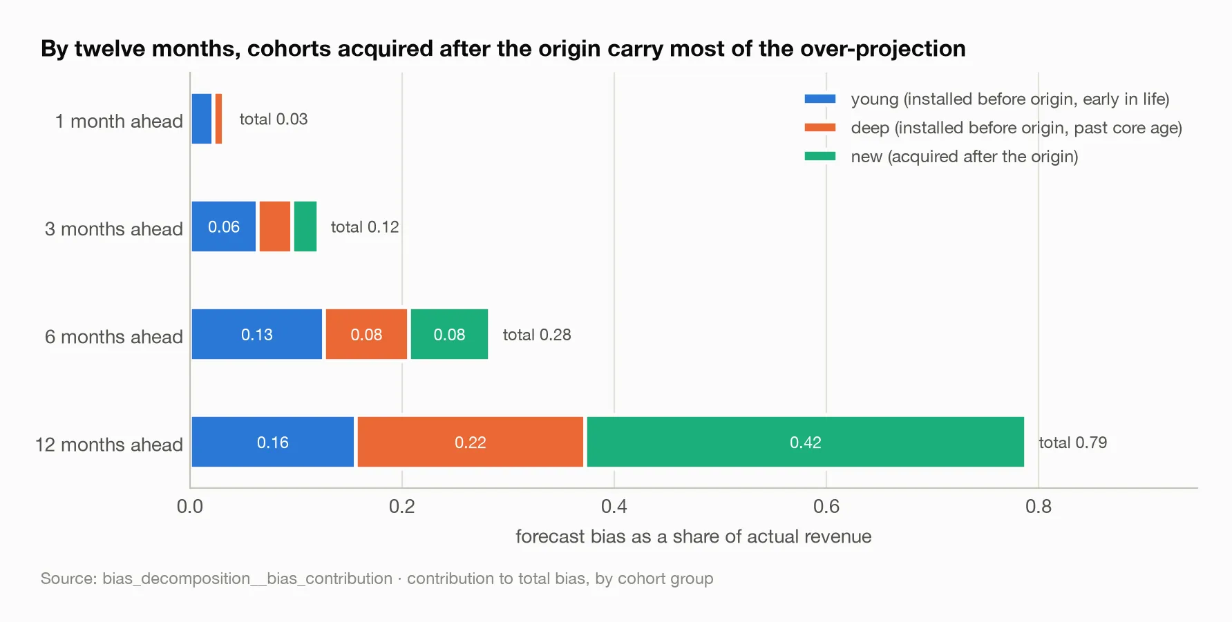
The groups sum to the total at every horizon, so this is arithmetic rather than inference. At one and three months the bias is small and spread; by twelve the green segment — cohorts the shape drift never touched — is over half of it.
The leading suspect was innocent. I had assumed the pooled deep-decay
fallback rate — reached when too few prior cohorts have themselves reached an
age — was driving the long-horizon error, and it was the natural thing to tune.
Replacing it with a perfect hindsight value changed the result by nothing at
any horizon: 0.716 bias at twelve months with the fallback, 0.716 with the
oracle (bias_decomposition__oracle_bias_by_horizon). It is a fallback this
panel rarely reaches. Tuning it would have been wasted effort.
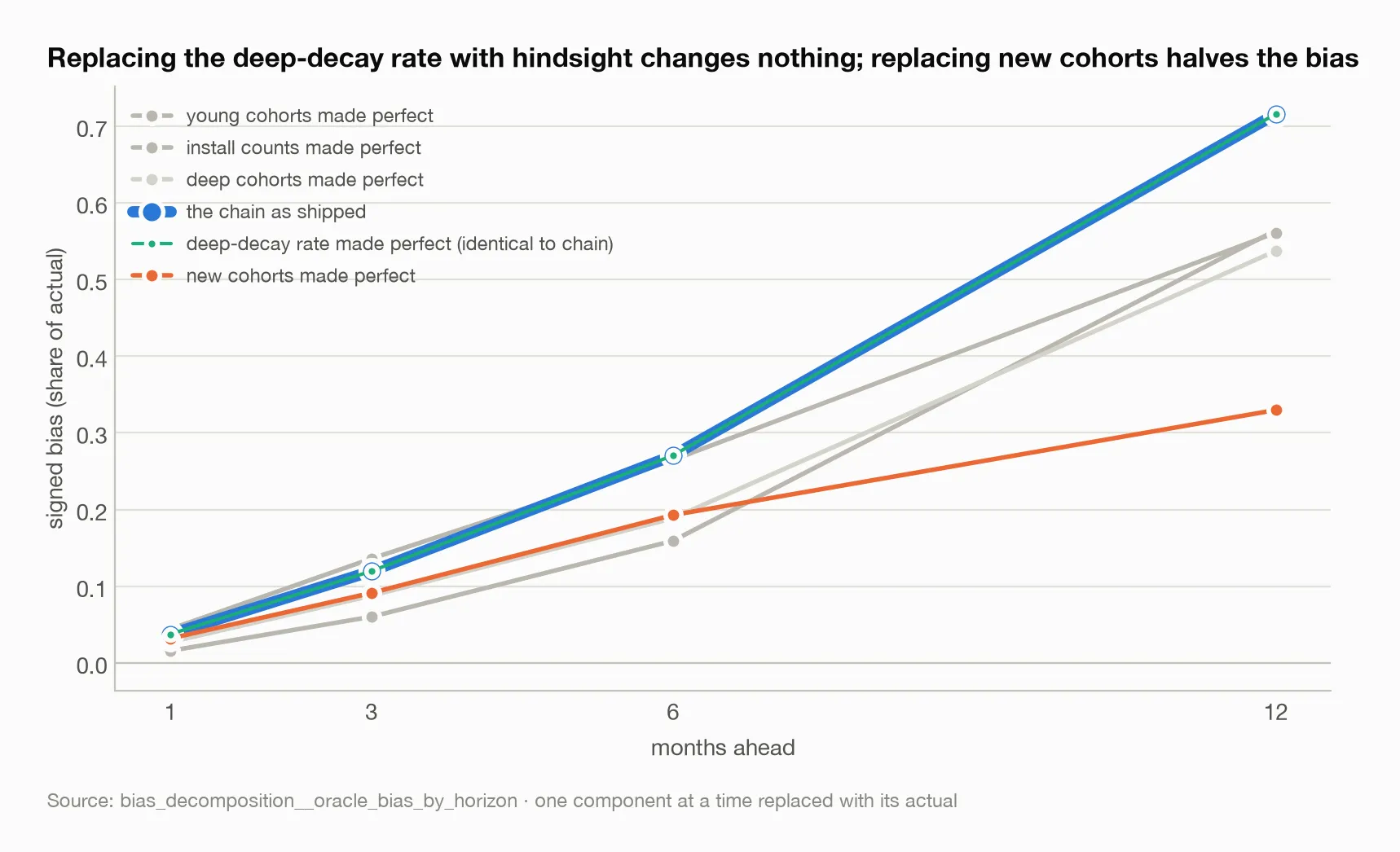
The thin aqua line sits exactly on the wide blue one: giving the deep-decay fallback a perfect value moves the forecast by nothing. Giving new cohorts their actual values is the only substitution that changes the twelve-month picture substantially.
The second title contradicted both claims the correction rested on. The
drift itself is real on both games. Its pattern is not. On the first title,
active users drift at −1.8% per cohort with an interquartile range of 0.003 —
extraordinarily tight — and monetising users barely drift at all, negative at
only 17 of 24 ages. On the second title, monetising users have the most
consistent drift in the study, negative at every age with the second-largest
slope, and active-user slopes are fourteen times more scattered
(drift_validation__drift_summary). “Apply per metric” assumed which metric
drifts is a property of the metric; it is a property of the game. “Pool the
slopes” assumed they cluster; on the second game, pooling averages away a real
difference.
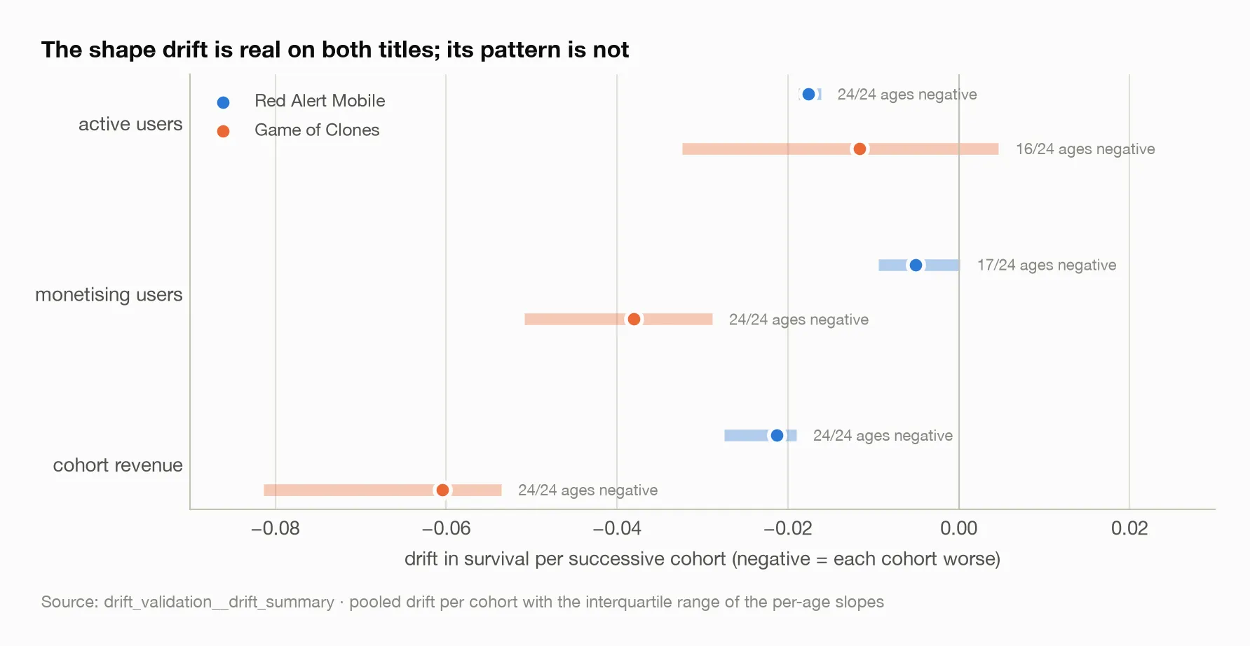
Each dot is the pooled drift; the band is the interquartile range of the per-age slopes it pools. On one title the bands are tight enough to justify pooling; on the other the active-user band crosses zero. The metric that barely drifts on one game is the one that drifts most consistently on the other.
Out of time, the shape correction improved revenue and monetising users on both
titles and harmed active users on both — the opposite of the per-metric rule I
had shipped, which turned it on for active users and off for monetising users.
On the second title the damage to active users was severe, a 48% increase in
error (drift_validation__drift_effect). And the shrinkage sweep inverted:
both accounts preferred the most shrinkage tested, monotonically
(drift_validation__shrink_damp_sweep) — that is, the best available version of
this correction was close to not applying it.
My published numbers were stale. The original result had been produced by a build five minutes older than the code that shipped, and did not reproduce. On shipped code the shape drift made the composed twelve-month error worse, not better. Every other variant reproduced to the digit. I record this because it is the kind of thing that is easy to leave out.
The attractive idea was a time trend in disguise. Cohort quality correlates
with the platform spend share of the cohort’s acquisition mix at +0.54 to +0.56
across three quality indices, on 37 cohorts
(mix_quality__quality_vs_mix_insample). That is a real correlation and a
genuinely different mechanism from “next quarter will be worse because last
quarter was” — the mix is chosen, and known in advance. Out of time it does not
work. A mix-only correction scores 0.340 against 0.342 for no correction at all;
a one-parameter time drift scores 0.303; adding mix to the time drift buys
under a percent, at 0.301 (mix_quality__mix_mape_by_horizon). And a richer
feature set that fits nearly three times better in sample — R² of 0.46 against
0.17 — forecasts worse than doing nothing, at 0.366.
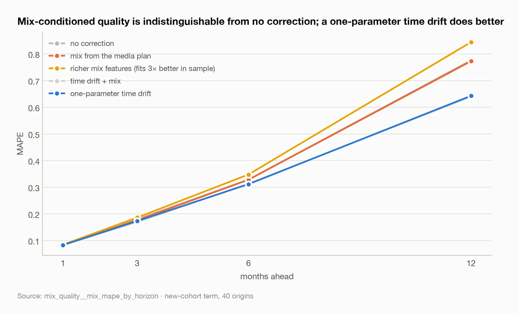
The no-correction and mix-from-plan lines lie on top of each other at every horizon. The richer feature set, which fits nearly three times better in sample, is the worst line on the chart.
The reason is the finding worth keeping. Platform spend share is correlated
−0.69 with cohort order; paid share is −0.82
(mix_quality__feature_trendiness). The mix features are largely time. On this
account the two hypotheses are observationally near-identical, and no amount of
out-of-time discipline separates causes that move together. I would now report
a driver’s correlation with time next to any claim that it is forecastable from
a plan.
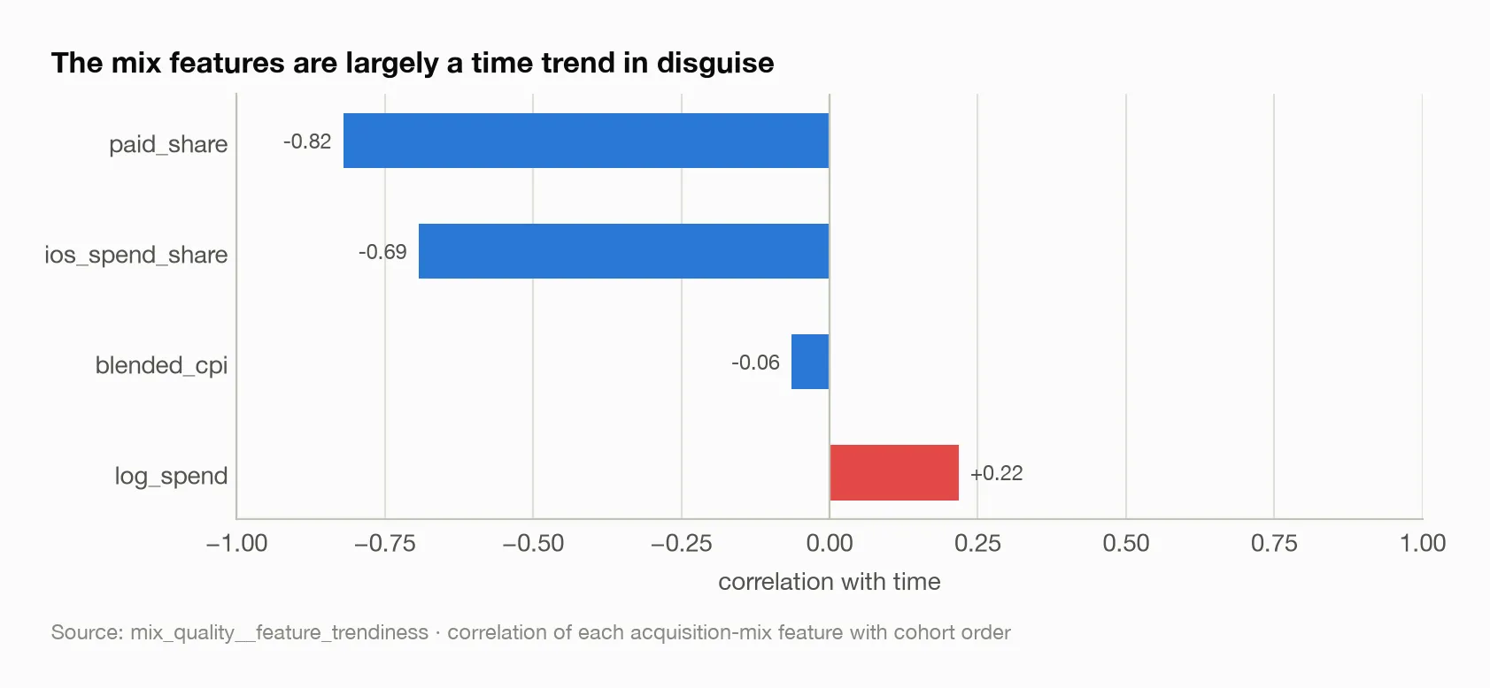
The two features that carry the in-sample correlation with cohort quality are the two most correlated with cohort order. The mix signal and the time signal are the same signal on this account.
What the estimates actually say
The version that replicates. The previous section identified the flaw: a drift on survival ratios cannot see a cohort that monetises worse at every age, and that is what the data shows. The replacement measures the drift on the level of revenue per install and applies it to the cohorts acquired after the origin.
Is the decline there on both titles? Revenue per install falls at every age
tested on both, 19 of 19: −4.9% per monthly cohort on the first and −5.9% on
the second (level_drift__level_drift_summary). That is stronger unanimity
than the shape drift ever reached.
Does correcting for it help out of time? Scored on the term the correction
touches — revenue from post-origin cohorts, built with their actual sizes so no
install-forecast error is mixed in — across six origins per account, error and
bias fall together at every horizon on both titles. Mean MAPE goes from 0.901
to 0.763 on the first title and from 0.584 to 0.571 on the second; bias from
+0.751 to +0.572 and from +0.372 to +0.291
(level_drift__level_drift_effect_by_horizon, level_drift__level_drift_verdict).
Error and bias falling together is what separates a correction from a fudge: a
tweak that only moves the level can buy error at the cost of bias, and this does
not. Those error rates are not comparable to the composed chain’s, because the
hardest term is being scored alone; read the differences between rows, not the
levels.
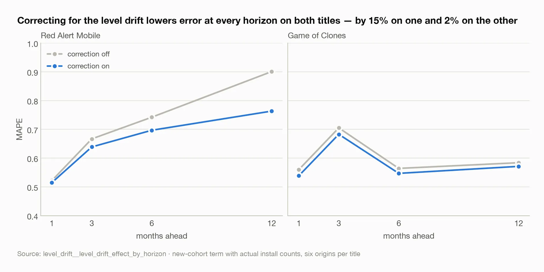
Both panels show the corrected line below the uncorrected one at every horizon. The size of the gap is what does not transfer between titles.
What still does not transfer. The size: mean error falls 15% on one title
and 2% on the other. “It replicates” is not “it transfers”. And the pooling
assumption is weak on the second title for the same reason it was weak before —
the per-age drift runs from −0.3% at age zero to −11.4% at age eighteen, where
on the first title it runs from −3.1% to −5.2% (level_drift__per_age_level_slopes).
On the first title cohorts arrive worth less and decay the same, which is what
“a level drift” means. On the second they arrive worth roughly what their
predecessors were worth and then decay faster — a shape change being summarised
by a level parameter. This time it does not break the correction, but the
signal-to-spread ratio reports it: 5.7 on the first title, 1.35 on the second.
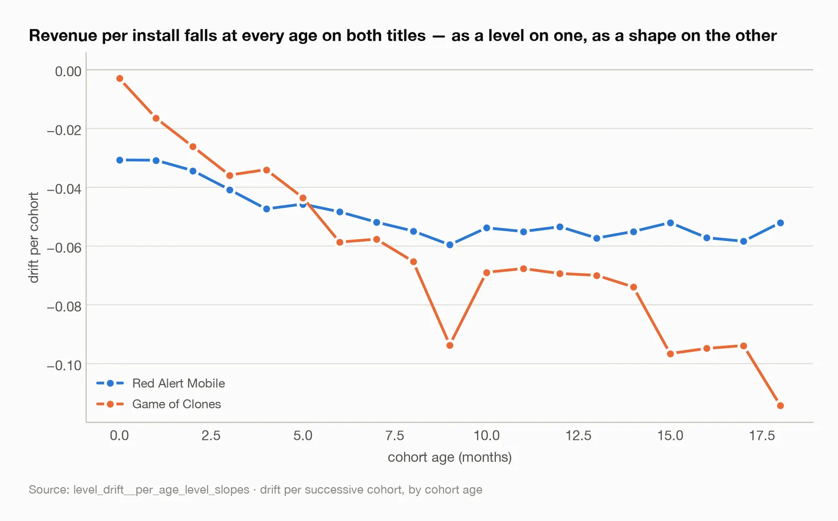
On Red Alert Mobile the per-age drift is nearly flat across ages: cohorts arrive worth less and decay the same. On Game of Clones it steepens from near zero at age zero to over ten percent at age eighteen — a shape change that a single pooled parameter can only approximate.
The parameters were deliberately left alone. Both accounts’ sweeps prefer
no shrinkage at all (level_drift__level_shrink_damp_sweep) — the opposite of
the shape drift. The shipped configuration shrinks by a quarter and damps at
0.95 anyway. Moving to the sweep optimum buys about 5% on one account and 0.2%
on the other, by fitting two parameters on twelve origins, and it removes
exactly the guard that limits the damage at the two origins where the estimated
drift comes out with the wrong sign. A hyperparameter a backtest prefers and a
failure mode argues against should lose to the failure mode.
What I would change next time
Decompose the bias first. An additive contribution split cost an afternoon and would have redirected this work at the start. I built a correction before I knew where the error was, and the correction did not reach it.
Check the spread before pooling, every time. The signal-to-spread ratio is six points on two titles — a hypothesis with a mechanism, not a validated threshold. On a third account I would compute it before shipping anything.
Test on a regime change. Both titles wound down paid acquisition inside the panel. Nothing here tests the drift against a genuine shift in acquisition strategy, and a drift fitted on a short window and assumed to persist is exactly the thing a regime change breaks.
Find an account where mix moves against time. The mix hypothesis is not refuted; it is unidentifiable on this data. An account where the media plan changed direction would separate the two.
The broader lesson
Four investigations produced negative results and one produced a correction that held. I think the four are worth more than the one. Each failure narrowed the search: per-age slopes were noise, so pool; the pooled shape drift never reached the cohorts that mattered, so look at level; the level drift replicated, so ship it, conservatively. The correction that survived was located by the ones that failed.
The thing I most want to remember is how obviously right the first design felt. Tight per-age slopes, a clean per-metric rule, a sweep that preferred the largest correction available — every signal on the first account pointed the same way, and two of three inverted on the second. Nothing about the first account’s evidence was wrong. It was simply evidence about one game.
And the mix result is the most general lesson of the study. A feature that correlates with your target and is knowable in advance sounds like exactly what a forecaster wants. Whether it is depends on a question that is cheap to ask and easy to skip: is it also just time?
Sources
Every figure above traces to one of these tables:
bias_decomposition__bias_contribution— bias by cohort group at each horizonbias_decomposition__oracle_bias_by_horizon— one component at a time replaced with its actualdrift_validation__drift_summary,drift_validation__drift_effect,drift_validation__drift_verdict,drift_validation__shrink_damp_sweep— the shape drift on both titlesmix_quality__quality_vs_mix_insample,mix_quality__mix_mape_by_horizon,mix_quality__feature_trendiness— mix-conditioned qualitylevel_drift__level_drift_summary,level_drift__level_drift_effect_by_horizon,level_drift__level_drift_verdict,level_drift__per_age_level_slopes,level_drift__level_shrink_damp_sweep— the level drift on both titles